Basic Causal Structures#
Understanding basic causal structures is crucial in causal inference because they possess unique properties that aid in the discovery of causal graphs from observational data. Additionally, recognising these structures is essential for correctly specifying regression models in statistical analysis. Indeed, incorrectly including variables in the regression models can lead to erroneous conclusions and model estimates.
Importance of Basic Causal Structures#
In causal discovery, basic causal structures help in discerning the underlying causal graph from observational data. These structures have unique properties that enable algorithms to translate conditional independencies into DAG structures. By understanding these properties, researchers can use methods like the PC algorithm and FCI algorithm to uncover the true causal relationships among variables [SGS01].
In causal inference, recognizing these structures is essential for specifying regression models correctly to avoid spurious relationships. Understanding which variables to include or exclude based on their causal roles ensures that the models provide valid and unbiased estimates. This knowledge helps in identifying confounders, mediators, and colliders, guiding the appropriate handling of these variables in statistical analysis [HR20].
Basic DAGs#
Chains#
A chain occurs when one variable causally affects a second, which in turn affects a third. This linear sequence shows the transmission of causality through an intermediary.
import numpy as np
from lingam.utils import make_dot

# Matrix of coefficients (weights)
m = np.array([[0.0, 0.0, 0.0],
              [1.5, 0.0, 0.0],
              [0.0, 1.2, 0.0]])

# Plotting causal graph
make_dot(m, labels=["weather \nfluctuations", "wind forecast \nerrors", "balancing \ncosts"])
Intel MKL WARNING: Support of Intel(R) Streaming SIMD Extensions 4.2 (Intel(R) SSE4.2) enabled only processors has been deprecated. Intel oneAPI Math Kernel Library 2025.0 will require Intel(R) Advanced Vector Extensions (Intel(R) AVX) instructions.
Intel MKL WARNING: Support of Intel(R) Streaming SIMD Extensions 4.2 (Intel(R) SSE4.2) enabled only processors has been deprecated. Intel oneAPI Math Kernel Library 2025.0 will require Intel(R) Advanced Vector Extensions (Intel(R) AVX) instructions.

As we saw in the previous chapter, this DAG represents the following structural causal model (SCM):
where the coefficients 1.5 and 1.2 represent the strenghts of the causal connections.
In this case, the causal association flows from the weather forecast to the balancing costs, and is (fully) mediated by the wind forecast errors. So, weather fluctuations influences wind forecast errors, which in turn influence a balancing costs.
For a generic chain structure given by \(A \rightarrow B \rightarrow C\), we have that:
\(B\) is an intermediate variable between \(A\) and \(C\),
\(A\) and \(C\) are conditionally independent given \(B\).
Forks#
A fork occurs when a single variable causally influences two other variables, making it a common cause to both. This structure typically indicates that the two downstream variables are correlated due to a shared source but do not causally influence each other. This coincides with the exmaple we saw in the previous chapter, where the common cause (temperature) gave the impression that electricity load and ice cream sales were correlated.
Another example, related to the balancing costs in the electricity markets, might be the effect of weather fluctuations on wind forecast errors and on electricity load due to increase heating (or cooling) demand.
# Matrix of coefficients (weights)
m = np.array([[0.0, 0.0, 0.0],
              [1.5, 0.0, 0.0],
              [0.7, 0.0, 0.0]])

# Plotting causal graph
make_dot(m, labels=["weather \nfluctuations", "wind forecast \nerrors", "heating \ndemand"])

This causal graph represents the following SCM:
where \(e_w, e_f, e_h \sim \mathcal{N}(0,1)\).
First, let’s generate some data from this DAG.
import pandas as pd
import matplotlib.pyplot as plt
%matplotlib inline
import seaborn as sns

# Setting a random seed for reproducibility
np.random.seed(42)

# Generating synthetic data
n = 100000
weather_fluctuations = np.random.normal(0, 1, n)  # average temperature in Celsius
forecast_errors = 1.5 * weather_fluctuations + np.random.normal(0, 1, n)  # Quadratic relationship for U-shape
heating = 0.7* weather_fluctuations + np.random.normal(0, 1, n)  # also influenced by temperature

# Creating a DataFrame
data = pd.DataFrame({'weather': weather_fluctuations, 'forecast errors': forecast_errors, 'heating demand': heating})

data.head()
| weather | forecast errors | heating demand | |
|---|---|---|---|
| 0 | 0.496714 | 1.775666 | 1.909541 |
| 1 | -0.138264 | -1.362751 | -0.191013 |
| 2 | 0.647689 | 1.546970 | -0.876154 |
| 3 | 1.523030 | 1.665306 | -0.322517 |
| 4 | -0.234153 | -0.678633 | -0.506558 |
Now, let’s plot the pairwise correlation plots.
# Setting up the plots
fig, axes = plt.subplots(1, 3, figsize=(18, 5))

# Temperature vs Electricity Load with hexbin plot
hb1 = axes[0].hexbin(data['weather'], data['forecast errors'], gridsize=50, cmap='Blues', bins='log')
axes[0].set_title('Weather fluctuations vs wind forecast errors')
axes[0].set_xlabel('Temperature (°C)')
axes[0].set_ylabel('Forecast error (MW)')

# Temperature vs Ice Cream Sales with hexbin plot
hb2 = axes[1].hexbin(data['weather'], data['heating demand'], gridsize=50, cmap='Blues', bins='log')
axes[1].set_title('Weather fluctuations vs heating demand')
axes[1].set_xlabel('Temperature (°C)')
axes[1].set_ylabel('Heating demand (MW)')

# Electricity Load vs Ice Cream Sales with hexbin plot
hb3 = axes[2].hexbin(data['forecast errors'], data['heating demand'], gridsize=50, cmap='Blues', bins='log')
axes[2].set_title('Wind forecast errors vs heating demand')
axes[2].set_xlabel('Forecast error (MW)')
axes[2].set_ylabel('Heating demand (MW)')

plt.show()
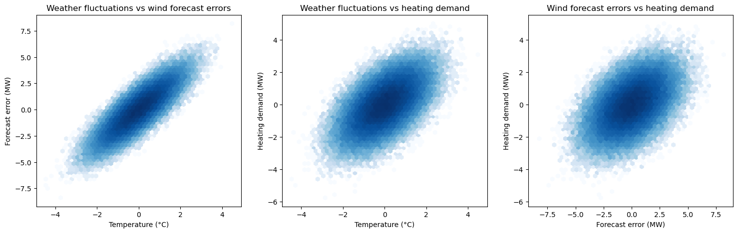
We can see that, despites not being causally related, wind forecast errors and heating demand appears to be positively correlated. This is because they have a common cause, represented by the weather fluctuations.
For a generic fork \(A \leftarrow B \rightarrow C\), we have that:
\(B\) is a common cause of \(A\) and \(C\).
\(A\) and \(C\) are dependent, but they become conditionally independent given \(B\).
Immoralities (or V Structures)#
An immorality happens when two variables independently cause a third variable, but there is no causal connection between the two independent variables. Conditioning on the common effect (collider) can introduce a spurious association between these independent variables.
# Matrix of coefficients (weights)
m = np.array([[0.0, 0.0, 0.0],
              [0.0, 0.0, 0.0],
              [2.0, 1.5, 0.0]])

# Plotting causal graph
make_dot(m, labels=["forecast \nerrors", "outages", "balancing \ncosts"])

This causal graph represents the following SCM:
where \(e_f, e_o, e_b \sim \mathcal{N}(0,1)\).
We will now see the effect of the Berkson’s paradox, which is the spurious correlation observed in the two parent variables, after conditioning on the collider.
First, let’s generate some data.
import pandas as pd
import matplotlib.pyplot as plt
%matplotlib inline
import seaborn as sns

# Set the random seed for reproducibility
np.random.seed(42)

# Generate data for the Immorality example
n = 100000
forecast_errors = np.random.normal(0, 1, n)
outages = np.random.normal(0, 1, n)
balancing_costs = 2 * forecast_errors + 1.5 * outages + np.random.normal(0, .1, n)  # the collider

data_immorality = pd.DataFrame({'forecast errors': forecast_errors, 'outages': outages, 'balancing costs': balancing_costs})

data_immorality.head()
| forecast errors | outages | balancing costs | |
|---|---|---|---|
| 0 | 0.496714 | 1.030595 | 2.695504 |
| 1 | -0.138264 | -1.155355 | -2.018984 |
| 2 | 0.647689 | 0.575437 | 2.025579 |
| 3 | 1.523030 | -0.619238 | 1.978338 |
| 4 | -0.234153 | -0.327403 | -0.993676 |
Now, let’s take a look at the correlations, after conditioning on the child variable.
# Setting up the plots
fig, axes = plt.subplots(1, 2, figsize=(12, 5))

# All the data
hb1 = axes[0].hexbin(data_immorality['forecast errors'], data_immorality['outages'], gridsize=50, cmap='Blues', bins='log')
# cb1 = fig.colorbar(hb1, ax=axes[0])
axes[0].set_title('Forecast errors vs outages \n(not conditioned)')
axes[0].set_xlabel('Forecast errors')
axes[0].set_ylabel('Outages')

# After conditioning
data_immorality_conditioned = data_immorality[data_immorality['balancing costs'] >= 5]
hb2 = axes[1].hexbin(data_immorality_conditioned['forecast errors'], data_immorality_conditioned['outages'], gridsize=50, cmap='Blues', bins='log')
# cb2 = fig.colorbar(hb2, ax=axes[1])
axes[1].set_title('Forecast errors vs outages \n(conditioning on balancing costs > 5)')
axes[1].set_xlabel('Forecast errors')
axes[1].set_ylabel('Outages')

plt.show()
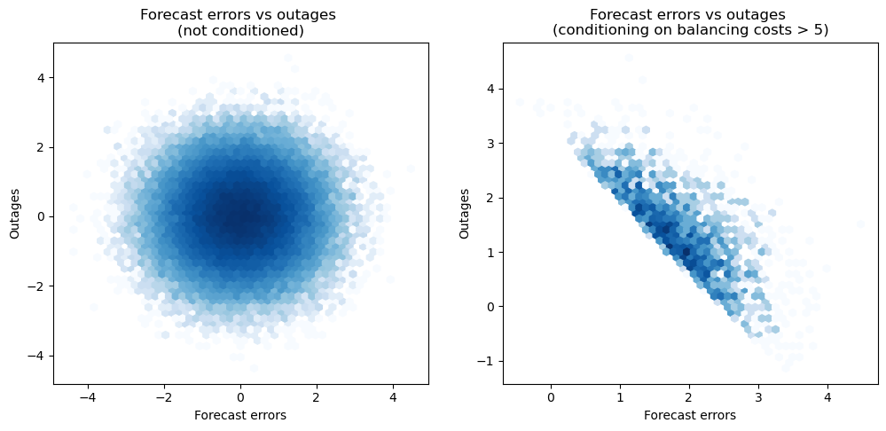
We can observe how conditioning on a collider introduces spurious correlations in the data. Outages and forecast errors are not causally related but, when conditioning on the balancing costs, they appear to be correlated. This underscores the importance of being cautious when attempting to draw causal conclusions from observational data. In practice, this means that including the collider as a predictor in a regression model can lead to misleading results, where the estimated coefficients deviate significantly from the true causal effects. This potential misstep highlights the necessity of carefully selecting variables for inclusion in regression models, especially when the goal is to uncover causal relationships rather than mere associations.
For a generic immorality \(A \rightarrow B \leftarrow C\), we have that:
\(B\) is a collider.
\(A\) and \(C\) are marginally independent but become dependent when conditioning on \(B\).
Practical Guidance for Regression Modelling#
In causal inference, understanding these basic structures is essential to avoid spurious correlations and incorrect model specifications. Specifically, they guide the selection of predictors in regression modelling to ensure valid and unbiased estimates. Including or excluding variables based on their causal relationships can significantly impact the validity of regression models. For example:
Including colliders: conditioning on a collider can introduce spurious associations between its causes, leading to biased estimates.
Omitting mediators: excluding a mediator can lead to underestimation of the direct effect of the predictor on the outcome.
When specifying regression models, it is crucial to:
Include confounders: variables that influence both the predictor and the outcome should be included to control for their confounding effect.
Exclude colliders: avoid conditioning on colliders to prevent introducing spurious correlations.
Consider Mmdiators: decide based on the research question whether to include mediators to understand direct versus indirect effects.
Properly accounting for these structures helps to clarify the causal pathways and ensures that the estimates reflect the true causal relationships.